This is pretty interesting:
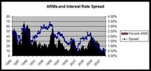
The bars show the percentage of new mortgages at any given time that are adjustable rate mortgages. As you can see, this ratio has fluctuated over time, going over 60% in the 1980s and over 50% at times in the 1990s. Right now it is very low (under 10%).
The line shows the “spread” between the prevailing interest rate on 30 year fixed rate mortgages versus ARMs. ARMs are always lower because with a FRM the borrower is essentially paying the lender to bear the risk of interest-rate fluctuations as well as (in the U.S.) the unlimited right of the borrower to refinance when interest rates go down means that the lender bears the prepayment risk as well. Borrowers pay a lot for this insurance–as you can see, the spread is usually in the neeighborhood of 100 to 150 basis points, although it fluctuates higher and lower as well.
Note the general pattern here–the percentage of mortgages that are ARMs almost perfectly tracks the spread between the interest rates on ARMs and FRMs. As ARMs become less expensive relative to FRMs, the percentage of ARMs rises. The artificially low rates on ARMs as a result of easy money policies during the early 2000s created the gap between short and long term rates.
The problem, of course, is that this spread can disappear in one of two ways. Either the rates on FRMs can come down, or the rates on ARMs can go up. In the 1980s and mid 1990s, the FRM fell. This last go around the rate on ARMs rose. Which has helped to spur the foreclosure problems we see, especially in areas of the country with a lot of ARMs.
Note also that this is not an issue of subprime v. prime–the regularity of the interaction between ARMs and FRMs held prior to the existence of the subprime market, and in fact, the percentage of ARMs in the market was much higher at times in the past.
What got me thinking about this more specifically is Stan Leibowitz’s article “Anatomy of a Train Wreck,” where he emphasizes the role of ARMs in the foreclosure crisis. The article is excellent and I agree with almost the whole thing with one caveat. Stan argues that the rise in ARMs is a proxy for a rise of speculation in the real estate market. His argument is that speculators disproportionately selected ARMs with an intention of flipping the property before the interest rate reset and that the are thus also disproportionately represented in foreclosure. I agree that the role of speculators is important and that before we do anything drastic with respect to foreclosure relief we want to figure out the extent to which speculators are disproportionately represented in foreclosure.
What this chart seems to suggest, however, is in the larger picture the ARM issue is separate from the speculator issue. The popularity of ARMs is driven by the interest rate spread between the interest rates on ARMs and FRMs and in the past we have seen ARMs become popular even for prime borrowers in real estate markets that weren’t as crazy as we’ve seen this past several years.
This is something that I suspect we knew intuitively, yet it is striking to see it on a graph like this. Teh only real anomaly seems to be in the early to mid-1990s, when the spread rose dramatically yet ARMs did not, before exploding in a wave of ARMs around 1995 or so.
As I discuss in my forthcoming article on “The Law and Economics of Subprime Lending,” ARMs are standard in most of the world and it is the United States that is an outlier in terms of having 30 year fixed-rate mortgages with unlimited prepayment rights.
