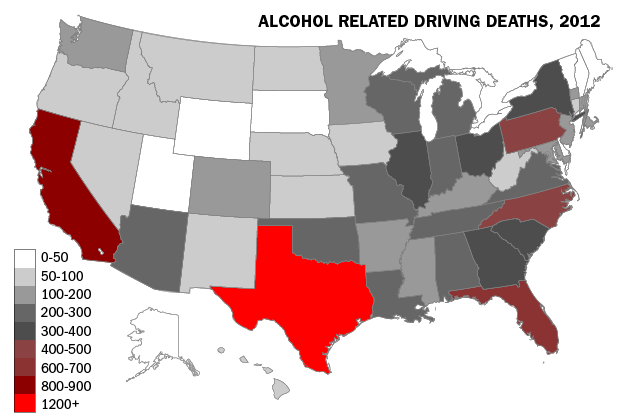
That’s a graphic from an article last month in Vocativ, titled “Way More People Die in Texas From Drunk Driving Than Anywhere Else. (Vocativ is a new media startup that got a good deal of buzz last Fall, including for relying on “data ninjas.”) Here’s some of the analysis accompanying the graphic:
Texas, in many ways, is its own country, and drunk driving there is a systemic problem; perhaps, it’s the inevitable consequence of a state that tends to see legislation as an intrusion, except when it comes to abortion. Over the last couple of years, Texas was America’s runaway leader in drunk-driving deaths. In 2011, for example, 1,216 died — comprising 40 percent of the state’s total fatalities. That was almost twice as many as the state with the second-most drunk-driving deaths, California. Outside Texas, the national average for such fatalities hovers around 180.
Yup, bright red Texas sure looks pretty dangerous on that map, though blood-red California, Florida, North Carolina, and Pennsylvania are right behind. Alaska, Utah, Wyoming, South Dakota, Vermont, New Hampshire, and Maine seem like the only really safe places.
Except the map means very little. Here’s another map, from a National Highway Transportation Safety Agency site, that might be more helpful (though it uses 2008 data rather than 2011 data):

The Vocativ map counts total alcohol-impaired auto accident deaths; the NHTSA counts such deaths per 100 million vehicle miles traveled. And, for purposes of determining whether “drunk driving … is a systemic problem,” and whether it stems from some special cultural factors, total alcohol deaths matter very little. There’s no sense, for instance, in showing California as one of the four reddest states (as the Vocativ map does), when its rate is below the national average, or in showing Wyoming as one of the seven white states when it actually has a high alcohol-impaired death rate (higher than Texas in 2007-08). The colors on the Vocativ map reflect the population of a state more than they reflect anything else, and while that might be useful in some unusual situations (e.g., in deciding in which state to try to do research on the subject), it’s not helpful in understanding how much of a drunk driving problem various states have.?
Indeed, while Texas has a relatively high alcohol-impaired fatality rate, the rate (see NHTSA 2007-08 data) is about 31% higher than the national average, and the ninth highest in the country — bad, but probably not “way more” than other states in any relevant sense. And saying that “Outside Texas, the national average for such fatalities hovers around 180” mostly reflects that the national average for state population is much less than that of Texas. If you want to talk about the drunk driving problems in Texas and other states with even higher alcohol-impaired fatality rates, great; but focus on what matters (the rate), not the raw quantity.
As to the “perhaps, it’s the inevitable consequence of a state that tends to see legislation as an intrusion, except when it comes to abortion,” there does seem to be something of a red state/blue state correlation, but even if there is some causation (I don’t know if there is), there’s nothing “inevitable” about it (not even justifying a “perhaps”) — consider, for instance, Utah, South Dakota, and Nebraska, which to my knowledge have political cultures similar to Texas’s, though other aspects of their cultures are of course quite different. (In Utah, the prevalence of Mormonism is likely part of the cause for the low rate.) And, just for the sake of completeness, the total for Texas is 57%-62% more than in California (because California has a lower rate than the rest of the country and Texas has a higher rate), according to the numbers the authors used, not quite “almost twice.”