In an earlier post, I asked for those with special expertise to examine the text accompanying the second extra cartoon of Mohammad, the one depicting him as a demon pedophile. I wondered whether the lettering suggested the possibility that the original language of the author of the cartoon was Arabic, not a Western language using the Roman alphabet. Andrew Sullivan, Betsy Newmark, Michelle Malkin, and ABC’s Jake Tapper have spread the call, as have other bloggers here, here, here, and here.
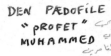
From the following picture, I deleted the actual drawing of Muhammad as a demon pedophile, retaining just the caption above the crude drawing:
(click to enlarge)

Reading through the comments so far to my earlier post, no true expert graphologist has come forward, but several people with at least some knowledge of Arabic writing and calligraphy have weighed in. The most interesting comment so far comes from E.S., who says he/she is not a graphologist but has “a little experience in English and Arabic calligraphy and typography”:
I noticed a few interesting things about the writing that may indicate that it isn’t the product of a native speaker.
1) If you look at the lowest horizontal stroke on the first capital E, it is a curved or squiggly line. This is characteristic of the arabic character “sukkund” which is denotes a glidle (sp?) stop. These symbols are used extensively in old texts in the Arab world including the Quran.
2) Many of the letters have too many strokes, and are thus inefficient. Over time native speakers develop proficiency in writing quickly and use less strokes per letter on average. Looking closely at the first M of the last line it has four strokes. Most native speakers would make it with two or three. Also notice on this M that the strokes don’t match up correctly. This indicates a lack of familiarity with the structure of the letter.
3) The cross strokes on the E’s and F’s seem to be drawn from right to left. The “ink clumping” you notice on some of the letters is formed when the author keeps the pen on the paper for too long without moving it. It often indicates hesitation in executing a stroke. If you look at the E and F in the word “Profet” the ink clumping is on the right hand side of the letter indicating that the person put pen to paper, considered the stroke momentarily, and then pulled the pen from right to left across the page. This is also inefficient in writing Roman letters because the movement across the page is from left to write, so cross strokes from right to left slow down the production of the letter. (Also interesting is the large amount of ink wasted on the beginning of the uppermost crossbar on the E in “Paedofile.” It appears that this stroke went from left to right [note the ink clumping on the left of the letter]). This is consistent with the idea that the person is an Arabic writer since the long delay would indicate a discomfort with the left-to-right stroke.
4) The u in “Muhammed” appears a great deal like the Arabic Laam (one of the most common letters as it is part of the arabic AL meaning the). If you notice the right side of the letter is longer, this is what an individual Laam looks like, almost like a Roman capital J. Also note that a native writer of Roman based letters would not make the right side larger as it is inefficient in writing a full word. There is no need to bring the pen that high if you’re going to move on to the next letter.
5) Finally as a general matter the letters do have a more “drawn” feel than usual native Roman-based letters. The cross strokes have the slant of calligraphy fonts, especially those used in Arabic. This is indicated by the sharp points on both ends of the cross which indicates that the pen was held at an angle. Most Roman letter writers without calligraphy experience hold their pen straight, which results in “block” letters and not angled letters. Finally the curves on the D’s are tapered which indicates holding of the pen at an angle, and experience with “drawn” letters. These same curved shapes are common in the arabic letters Jeem, Haah, and one other that I am not even going to attempt to transliterate but comes from the back of the throat.
I hope that others — with even more extensive knowledge — will come forward to assess the evidence in the text accompanying the “demon pedophile” cartoon.
Comments are closed.