When the CRU at East Anglia disclosed that it had lost some of the raw temperature data, leaving only the “homogenized” data, some honest commentators expressed the hope that the homogenizing was competently done.
Anyone who has been following Climate Audit for the last few years knows that at least some of the adjustments to the raw data done by the major data depositories appear to have been incompetently done at best. The statistical techniques used in the scientific backwater of historical climatology are often ad hoc, bearing little relation to the techniques that are standard in other fields. In particular, their techniques for handling missing data are particularly unscientific.
Perhaps the most accessible blog post demonstrating the effects of homogenization adjustments on a set of temperature records is by Willis Eschenbach at Watts Up With That.
The Smoking Gun At Darwin Zero
People keep saying “Yes, the Climategate scientists behaved badly. But that doesn’t mean the data is bad. That doesn’t mean the earth is not warming.”
Let me start with the second objection first. The earth has generally been warming since the Little Ice Age, around 1650. There is general agreement that the earth has warmed since then. See e.g. Akasofu. Climategate doesn’t affect that.
The second question, the integrity of the data, is different. People say “Yes, they destroyed emails, and hid from Freedom of information Acts, and messed with proxies, and fought to keep other scientists’ papers out of the journals … but that doesn’t affect the data, the data is still good.” Which sounds reasonable.
There are three main global temperature datasets. One is at the CRU, Climate Research Unit of the University of East Anglia, where we’ve been trying to get access to the raw numbers. One is at NOAA/GHCN, the Global Historical Climate Network. The final one is at NASA/GISS, the Goddard Institute for Space Studies. The three groups take raw data, and they “homogenize” it to remove things like when a station was moved to a warmer location and there’s a 2C jump in the temperature. The three global temperature records are usually called CRU, GISS, and GHCN. Both GISS and CRU, however, get almost all of their raw data from GHCN. All three produce very similar global historical temperature records from the raw data.
So I’m still on my multi-year quest to understand the climate data. You never know where this data chase will lead. This time, it has ended me up in Australia. I got to thinking about Professor Wibjorn Karlen’s statement about Australia that I quoted here:
Another example is Australia. NASA [GHCN] only presents 3 stations covering the period 1897-1992. What kind of data is the IPCC Australia diagram based on?
If any trend it is a slight cooling. However, if a shorter period (1949-2005) is used, the temperature has increased substantially. The Australians have many stations and have published more detailed maps of changes and trends.
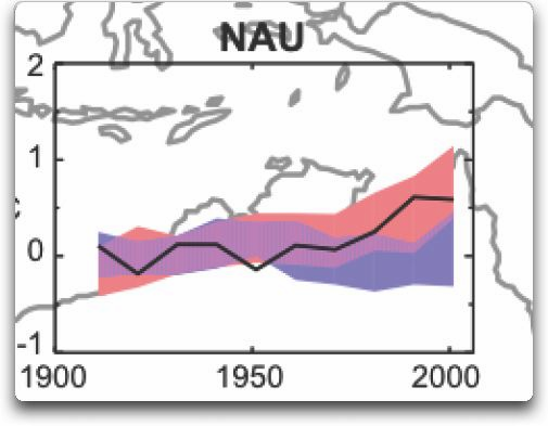
The folks at CRU told Wibjorn that he was just plain wrong. Here’s what they said is right, the record that Wibjorn was talking about, Fig. 9.12 in the UN IPCC Fourth Assessment Report, showing Northern Australia:
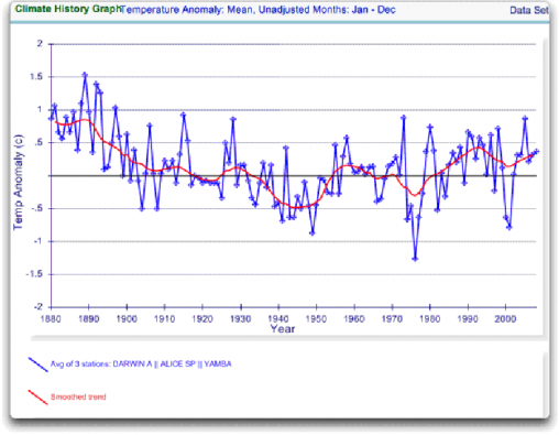
Figure 1. Temperature trends and model results in Northern Australia. Black line is observations (From Fig. 9.12 from the UN IPCC Fourth Annual Report). Covers the area from 110E to 155E, and from 30S to 11S. Based on the CRU land temperature.) Data from the CRU.One of the things that was revealed in the released CRU emails is that the CRU basically uses the Global Historical Climate Network (GHCN) dataset for its raw data. So I looked at the GHCN dataset. There, I find three stations in North Australia as Wibjorn had said, and nine stations in all of Australia, that cover the period 1900-2000. Here is the average of the GHCN unadjusted data for those three Northern stations, from AIS:
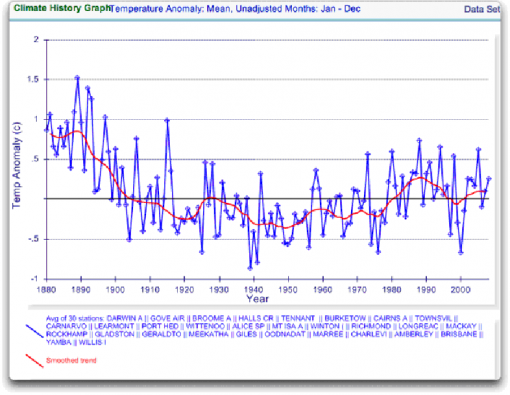
Figure 2. GHCN Raw Data, All 100-yr stations in IPCC area above.So once again Wibjorn is correct, this looks nothing like the corresponding IPCC temperature record for Australia. But it’s too soon to tell. Professor Karlen is only showing 3 stations. Three is not a lot of stations, but that’s all of the century-long Australian records we have in the IPCC specified region. OK, we’ve seen the longest stations record, so lets throw more records into the mix. Here’s every station in the UN IPCC specified region which contains temperature records that extend up to the year 2000 no matter when they started, which is 30 stations.
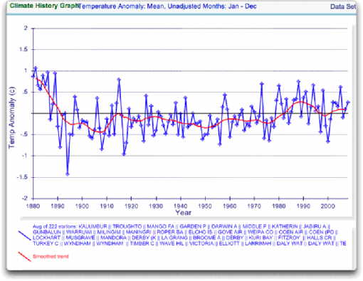
Figure 3. GHCN Raw Data, All stations extending to 2000 in IPCC area above.Still no similarity with IPCC. So I looked at every station in the area. That’s 222 stations. Here’s that result:
Figure 4. GHCN Raw Data, All stations extending to 2000 in IPCC area above.So you can see why Wibjorn was concerned. This looks nothing like the UN IPCC data, which came from the CRU, which was based on the GHCN data. Why the difference?
The answer is, these graphs all use the raw GHCN data. But the IPCC uses the “adjusted” data. GHCN adjusts the data to remove what it calls “inhomogeneities”. So on a whim I thought I’d take a look at the first station on the list, Darwin Airport, so I could see what an inhomogeneity might look like when it was at home. And I could find out how large the GHCN adjustment for Darwin inhomogeneities was.
Eschenbach proceeds to set out what an “inhomogeneity” is and show that the GHCN must have done something other than they claimed to have done to make the adjustments they did. In the course of this, he shows some stunning anomalies:
Then I went to look at what happens when the GHCN removes the “in-homogeneities” to “adjust” the data. Of the five raw datasets, the GHCN discards two, likely because they are short and duplicate existing longer records. The three remaining records are first “homogenized” and then averaged to give the “GHCN Adjusted” temperature record for Darwin.
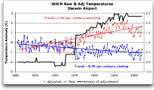
To my great surprise, here’s what I found. To explain the full effect, I am showing this with both datasets starting at the same point (rather than ending at the same point as they are often shown).
Figure 7. GHCN homogeneity adjustments to Darwin Airport combined recordYIKES! Before getting homogenized, temperatures in Darwin were falling at 0.7 Celcius per century … but after the homogenization, they were warming at 1.2 Celcius per century. And the adjustment that they made was over two degrees per century … when those guys “adjust”, they don’t mess around. And the adjustment is an odd shape, with the adjustment first going stepwise, then climbing roughly to stop at 2.4C.
Eschenbach goes on:
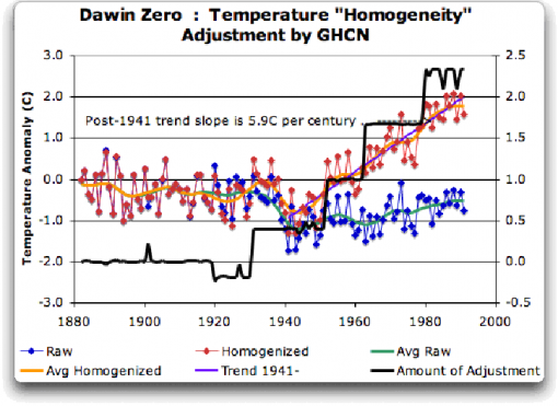
Intrigued by the curious shape of the average of the homogenized Darwin records, I then went to see how they had homogenized each of the individual station records. What made up that strange average shown in Fig. 7? I started at zero with the earliest record. Here is Station Zero at Darwin, showing the raw and the homogenized versions.
Figure 8 Darwin Zero Homogeneity Adjustments. Black line shows amount and timing of adjustments.Yikes again, double yikes! What on earth justifies that adjustment? How can they do that? We have five different records covering Darwin from 1941 on. They all agree almost exactly. Why adjust them at all? They’ve just added a huge artificial totally imaginary trend to the last half of the raw data! Now it looks like the IPCC diagram in Figure 1, all right … but a six degree per century trend? And in the shape of a regular stepped pyramid climbing to heaven? What’s up with that?
Those, dear friends, are the clumsy fingerprints of someone messing with the data Egyptian style … they are indisputable evidence that the “homogenized” data has been changed to fit someone’s preconceptions about whether the earth is warming.
One thing is clear from this. People who say that “Climategate was only about scientists behaving badly, but the data is OK” are wrong. At least one part of the data is bad, too. The Smoking Gun for that statement is at Darwin Zero.
So once again, I’m left with an unsolved mystery. How and why did the GHCN “adjust” Darwin’s historical temperature to show radical warming? Why did they adjust it stepwise? Do Phil Jones and the CRU folks use the “adjusted” or the raw GHCN dataset? My guess is the adjusted one since it shows warming, but of course we still don’t know … because despite all of this, the CRU still hasn’t released the list of data that they actually use, just the station list.
Another odd fact, the GHCN adjusted Station 1 to match Darwin Zero’s strange adjustment, but they left Station 2 (which covers much of the same period, and as per Fig. 5 is in excellent agreement with Station Zero and Station 1) totally untouched. They only homogenized two of the three. Then they averaged them.
That way, you get an average that looks kinda real, I guess, it “hides the decline”.
Oh, and for what it’s worth, care to know the way that GISS deals with this problem? Well, they only use the Darwin data after 1963, a fine way of neatly avoiding the question … and also a fine way to throw away all of the inconveniently colder data prior to 1941. It’s likely a better choice than the GHCN monstrosity, but it’s a hard one to justify.
Figures 7 and 8 are indeed stunners: “homogenizing” in effect changes slight temperature declines into huge temperature increases.
To get the full flow of the argument, please read Eschenbach’s whole post.
Turning declines in raw data into rises in one’s tables is one of the things that led to Michael Bellesiles’s resignation from Emory in the Arming America scandal.
Remember, people are usually at least somewhat circumspect in writing emails to professional colleagues around the world. Thus, is it likely that the corruption in this subfield of climatology is LESS serious or MORE serious than the scientists would disclose to their colleagues in their own emails?
Comments are closed.