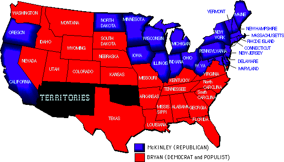
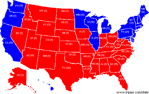
The Distribution of States in 2004 closely matches 1896.-- 
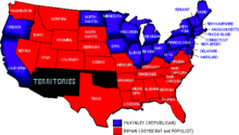
Ralph Luker suggested that the 2004 election looked much like the 1896 election, with the Republican and Democratic states switched. What makes George Bush like William Jennings Bryan? David Beito has these maps:

1896 (from David Beito):


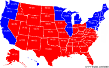
2004 (from David Beito):


A comment to Beito's post:
[A]lthough the geographic divide remains the same, the parties themselves have traded places and survived the process. Understanding this switch is to me, at least, one of the most important stories in the past 100+ years of American politics.
Another comment says that Kentucky should have been assigned to McKinley.

Is Bush a cross between Woodrow Wilson and William Jennings Bryan?-- I posted the maps that Ralph Luker and David Beito had suggested looked like mirror images--1896 and 2004. Two correspondents, Ash Valentine and William Quale, have pointed me to the 1916 map, with Bush playing the role of Woodrow Wilson.

Here is the 1916 map from PresidentElect.org:


It is kind of sobering to see George W. Bush as a cross between Woodrow Wilson (a big-government wartime President) and William Jennings Bryan (a religious populist). The interesting question is not the men, but the complete shift in the sources of party strength.

Another noteworthy thing is that most of the historical political map makers still use the long traditional colors for party maps--red for Democrats and blue for Republicans, blue perhaps suggesting bluebloods and red perhaps suggesting socialism. If you called someone a "red," you would think him on the left (consider the movie "Reds"). When I was young, all the TV networks did the same (red for Democrats, blue for Republicans), but I am guessing that this consensus broke down sometime in the 1970s or early 1980s, and was completely switched over on all networks at least by the 2000 election. It was probably a conscious decision to reverse the implications of the standard red=left, blue=right imagery, but I have found it awfully confusing. It's nice, however, for making the comparisons to 1916 and 1896.

UPDATE:

It is even more sobering to see this map showing the free states and territories compared to the slave states, posted by Kevin Drum, following a comment by Ken Layne.

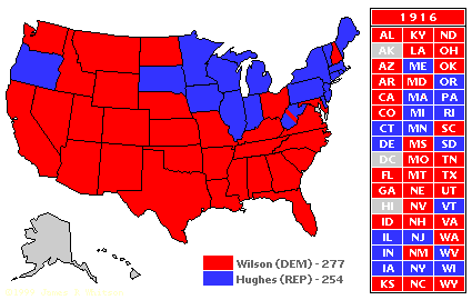
Bill Stuntz writes on the 1896, 1916, & 2004 election pattern.-- Bill Stuntz, who started as an assistant professor at UVA when I was a visiting professor there in the mid-1980s, is now a professor at the Harvard Law School. He wrote me an email on the voting patterns that I and many others have been noting:
There have been six elections with this basic pattern, South and West versus Northeast (more recently, the Pacific Coast joins the Northeast), with the Midwest divided. The first is 1896, and that's the only one the candidate of the Northeast wins. The others -- 1916, 1948, 1968, 2000, and now 2004 -- are all won by the candidate of the South and West, who always wins at least a couple of Midwestern states, always including Ohio and Missouri. The key is that the Midwest has never identified culturally with the Northeast. In a close election, it just isn't possible for a candidate like Kerry to sweep the region -- and he had to nearly sweep the region in order to win.

I did an article that was partly about this pattern (mostly about the similarities of 2004 to 1948) at techcentralstation.com before the election.
I had read his prescient article when it came out, but it had slipped my mind. It was enttitled: "Why Dewey Defeats Truman -- And Bush Beats Kerry?"